Your Logo: The Cover of Your Company’s Book
Design can be a powerful tool to convey your brand to your audience. And the first design element your audience typically encounters is your logo. A logo may be small, but it can make a huge impression when done well. So, how can you choose a logo that will make a solid, professional impression of your brand while still representing your company’s personality?

I’ve compiled a few suggestions to help make the logo development process run smoothly:
Make a strong, simple first impression.
I once had a logo project years ago for a marathon. My client insisted on using a runner, musical notes and—at the last minute—they wanted to add palm trees because of the location. I’m not sure what image you have in your mind right now, but the reality was worse. I did the best I could with what was asked of me, but I knew that the logo wasn’t following design best practices. The point is, a logo is the ‘book cover’ of your business—a tag line, supporting messaging and imagery is what you rely on to tell the story. As the first impression of your brand, your logo should give your consumer a positive ‘gut feeling’ about your brand and communicate a bit of general information about what your company does. This is best done in short order using clean, simple design techniques.
Start in black and white.
Unless you have an established color palette, develop ideas for the first and second round of logos in black and white only. Taking color out of the equation allows you to focus on the composition of the logo. This also ensures that your logo will be production-friendly across multiple configurations, especially when color is not an option. Color should enhance the logo but shouldn’t be relied upon. Once you have narrowed your options down to one or two favorites, begin working on color options.
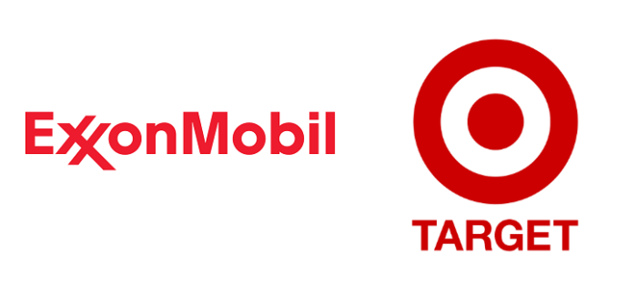
Decide on an overall logo format. Most people envision an icon or symbol when they think about what makes a logo, but stylized type treatments can be equally as effective. Symbols can encompass your brand’s story and should work in tandem with the treatment of your brand name. Font treatments can function as very clean, straightforward logos. An example of an effective font treatment logo is Exxon; the designer stylized the letters to transform a font into a unique, recognizable logo. Retail giant Target, on the other hand, has developed a symbol that is simple yet iconic—while also playing off the literal meaning behind the company name.

Don’t forget about a logo usage guide.
A logo usage guide gives you rules of thumb for how to use your logo in a consistent manner and style. It should include reference information for color palette, whitespace, size restrictions and other stipulations for using your logo. When working on an identity project, Reuben Rink always provides a comprehensive style guide that helps our clients ensure brand consistency.
TL;DR
When creating your next logo, be sure to keep these questions in the back of your mind:
- Does your logo contain a simple mark or icon that is uniquely representative of your business?
- If your logo only uses a type treatment, is the type treatment distinctive or stylized?
- Does your logo look as good in black as it does in color?
- Does your logo scale well to a reduced size (design elements don’t distort or disappear)?
- Is your logo easy to read and understand?
Designing a logo for your business can be a daunting task, but I hope this post will get you started on the right track. Remember to breathe, take your time, and enjoy the process.
Feeling overwhelmed when it comes to logo and identity work? Contact us today to see how we can help!
